
How to Create and Change Instagram Highlight Covers
 Revive.Social Editorial
 Instagram Highlight covers give people a quick visual map of the saved Stories on your profile. A useful set is simple, consistent, and designed around the circular crop that appears on the profile, not around every corner of the square source image.
You can make a cover in almost any image editor, export it as a static image, and select it from the relevant Highlight controls in Instagram. The exact labels can vary by app version and account, so this guide focuses on the durable design and editing decisions rather than a brittle sequence of buttons. ✨
Below, you will learn how to plan the safe area, build a reusable cover system, change a cover, check accessibility, and use downloaded assets without creating a licensing problem.
What an Instagram Highlight cover does
A Highlight lets you organize selected Stories into a collection that remains available from your profile after the original Story has expired. The feature launched as a way to group and present those saved moments on a profile.[1] The cover is the small image people see before they open that collection.
The cover does not need to summarize every Story inside. Its job is closer to a navigation icon: it should help a visitor distinguish “Products” from “FAQ,” “Events,” or “Reviews” at a glance. 🧭 Clear categories usually do more useful work than elaborate artwork.
Start by listing the profile information a new visitor is most likely to seek. Keep only categories that have enough useful Stories to maintain. If two labels mean nearly the same thing, combine them so the row of covers stays easy to scan.
- Use short Highlight names that remain understandable when truncated.
- Choose one visual idea for each category.
- Keep colors, icon style, and spacing consistent across the set.
- Remove or rename a Highlight when its contents no longer match the promise.
Plan the safe area for a circular crop
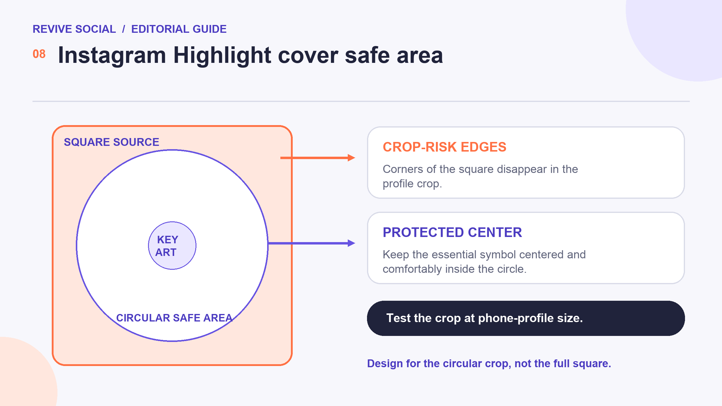
Create the source artwork on a square canvas, but treat the center as the usable area. The profile presentation crops the artwork into a circle, so anything near a corner or outer edge may disappear. Keep the main icon, initials, or symbol comfortably inside an imaginary centered circle. 🎯
A practical approach is to add a temporary circular guide in your editor. Place the important content well inside it, preview the cover at a small size, and remove the guide before export. Avoid relying on an exact pixel template unless you have verified it in the current app, because display sizes and interfaces can change.
Test the whole set, not only one cover. Repeated spacing makes a profile feel coherent, while tiny differences in icon size can make adjacent covers look uneven. Zoom out until the covers are close to their real profile size and ask whether every category is still recognizable.
Create a static cover in Canva or another editor
You can build the artwork in Canva, a desktop design app, or any editor that can export a clean static image. The specific tool matters less than using a repeatable system. Start with one master square, then duplicate it for each category so the background, margins, and icon scale remain stable.
1. Choose a simple visual language
Pick either icons, short initials, or plain color fields. Mixing detailed illustrations, photos, and line icons in one row can make the set harder to understand. One recognizable idea per cover is usually enough. 💡
2. Build one master cover
Set the background, center guide, icon size, and spacing once. Duplicate that master for the remaining categories and replace only the symbol or label. This reduces accidental differences and makes future additions faster.
3. Export a static image
Export the finished cover in a common static image format. Inspect the file before uploading: the background should be even, the icon should have clean edges, and no guides should remain. Keep an editable master file so you do not have to rebuild the system when a new category appears. 🛠️
4. Document the cover system
Save the source, exported files, icon licenses, and a one-page style note in the same project folder. Record the background colors, icon family, center guide, export format, and naming pattern. A future teammate should be able to add “Shipping” or “Press” without guessing why the older covers look the way they do.
Use clear filenames such as highlight-cover-faq instead of a download name such as final-2. Keep retired versions in an archive rather than overwriting the only editable copy. 🗂️ This makes it easier to reverse a design change when a new icon performs poorly beside the established set.
Plan for categories to change. A launch cover may be useful for a month, while “Start here” and “Support” can remain for much longer. Mark temporary covers with a review date and assign an owner. Without that maintenance rule, a polished profile can still send visitors into expired offers or obsolete instructions.
Before exporting the full set, run a five-second recognition check. Show the row at profile size to someone who does not know the design system, hide the labels briefly, and ask what each symbol suggests. The answer does not need to be perfect, because the text label remains available, but repeated confusion is a good reason to simplify an icon. 👁️
Upload or change a Highlight cover
Open the relevant Highlight from your profile and look for its editing controls, then choose the cover-editing option available on your account. Select the static image, reposition it within the circular preview if that control appears, and save the change. Official Help Center guidance is the right place to confirm the current labels immediately before you edit.[2]
If the expected option is missing, first update the app and reopen the profile. Then check another Highlight to determine whether the issue affects one collection or the account. Features sometimes roll out unevenly, so avoid repeatedly deleting a working Highlight just to expose a control. 📱
After saving, return to the main profile and inspect the row as a visitor would. A cover that looks centered in the editor can still feel off beside its neighbors. Make one adjustment at a time, save, and check again.
Design for contrast, consistency, and accessibility
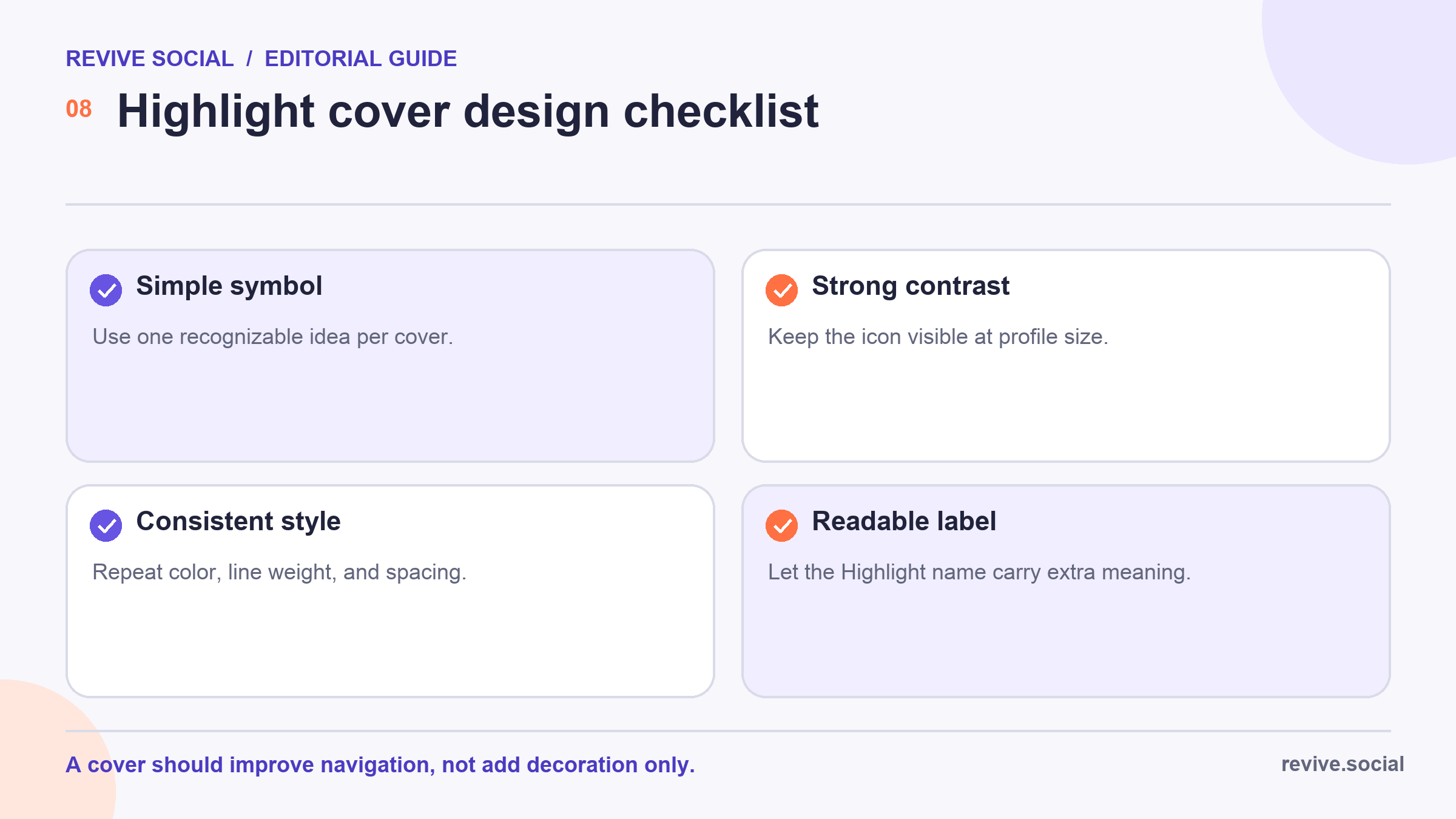
Highlight covers are small, so fine detail and subtle color differences disappear quickly. Use a foreground and background with strong visual contrast. Keep line weight substantial enough to survive the profile-size preview, and do not depend on color alone to distinguish important categories.
The Highlight name provides meaning that the cover cannot. Use a readable label below each cover, and avoid putting a long word inside the artwork. If an icon could mean several things, pair it with a direct category name such as “FAQ” or “Events.” ✅
- Preview the artwork at a small size instead of judging it only while zoomed in.
- Check the set on more than one screen when possible.
- Avoid flashing, animated, or overly busy source material for a navigation cover.
- Ask someone unfamiliar with the account what each cover seems to mean.
Consistency does not require every cover to be identical. A seasonal campaign can use a different accent color, for example, while keeping the same icon style and margins. The goal is predictable navigation, not visual sameness for its own sake. 🎨
Use downloaded cover assets safely
A template or icon being easy to download does not automatically give you the right to use it for every purpose. Read the license for the exact asset, not only the marketplace homepage. Check whether commercial social-media use, modification, client work, and redistribution are allowed.
Marketplaces such as Creative Market collect assets from many creators, so terms can differ between products.[3] Save a copy of the license and purchase record with the editable source file. That record is much easier to find later than a product page that may have moved. 📁
Also check fonts and icon libraries separately. A cover template may include a preview font or graphic that is not part of the download license. When the scope is unclear, use an original shape, a properly licensed alternative, or ask the creator before publishing.
Fix a cover that looks cropped, blurry, or unreadable
If the icon is cropped: move it toward the center and reduce its size. Do not solve the problem by stretching the square, because that can distort the artwork. Keep the outer area as breathing room.
If the cover looks blurry: return to the original editable file and export again. Repeatedly saving a downloaded preview can compound compression. Make sure the source is genuinely square and that the icon is not a tiny graphic enlarged far beyond its original size. 🔍
If the cover is unreadable: remove detail before adding size. Simplify the symbol, strengthen contrast, and let the Highlight name carry the full label. A profile cover is closer to a signpost than a miniature poster.
If the set feels inconsistent: compare every cover with the master. Check center position, symbol scale, background tone, and line weight in that order. Fixing one shared rule usually produces a cleaner result than adjusting each cover by eye. 🧩
Once the covers are in place, review the Stories inside each Highlight too. The clearest cover cannot rescue an outdated collection. For a broader maintenance workflow, see the guide to organizing Instagram Highlights.
Schedule a quarterly cover audit and repeat it after any rebrand. Confirm that every label, symbol, destination, and archived Story still serves a current visitor question.
References
- [1] Meta: Introducing Stories Highlights and Stories Archive
- [2] Instagram Help Center: Highlights guidance
- [3] Creative Market: Instagram templates

