Instagram Fonts: How to Use Fancy Text Safely
 Revive.Social Editorial
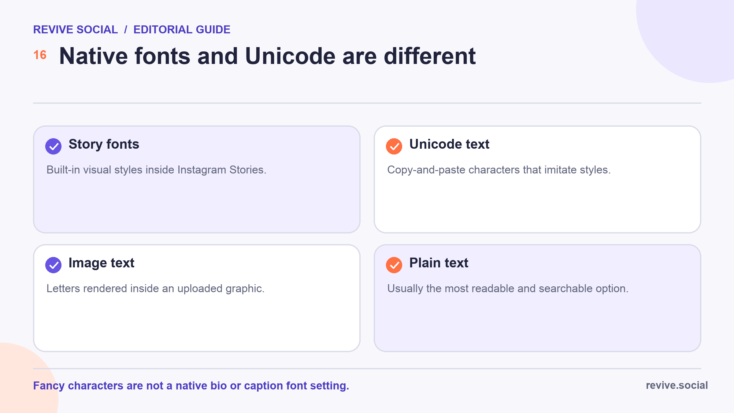
 Most “Instagram fonts” used in a bio, profile name, or caption are not fonts at all. They are Unicode characters that resemble bold, italic, script, or outlined letters. You generate the characters elsewhere, copy them, and paste them into Instagram. The native text styles inside Stories are a separate feature.[1]
That distinction matters because decorative characters can render differently across devices and assistive technology. This guide shows how to test a short style, keep essential information readable, and decide when plain text is the safer choice. ✨
Understand native Instagram Story fonts vs Unicode fancy text
Instagram Stories include native text controls. You type in the Story composer, choose an available style, and Instagram renders that text as part of the Story. The exact controls and styles can change as Instagram updates its creation tools.
A fancy-text generator works differently. It maps ordinary letters to other characters in the Unicode standard. For example, a tool may substitute mathematical alphanumeric symbols for regular Latin letters. The result can look like a new font, but the pasted characters are different code points. 🔤
- Native Story style: created and rendered within Instagram’s Story editor.
- Unicode text: generated outside Instagram and pasted into a supported text field.
- Text in an image: designed in a graphics editor and uploaded as pixels, not editable profile text.
- Plain text: standard characters that usually create the fewest reading and copying problems.
Do not describe a generator as unlocking a hidden Instagram font setting. It creates text that Instagram may accept, and that text still has to survive rendering, search, copying, and accessibility checks.
Unicode also includes combining marks, symbols, and lookalike characters. A generator can stack marks above or below letters or replace a familiar letter with a visually similar character. That may produce unexpected cursor movement, selection, wrapping, pronunciation, or moderation behavior. Do not paste a result you cannot inspect character by character, especially into an account name or business identity. 🔬
Test a style before putting it in your bio
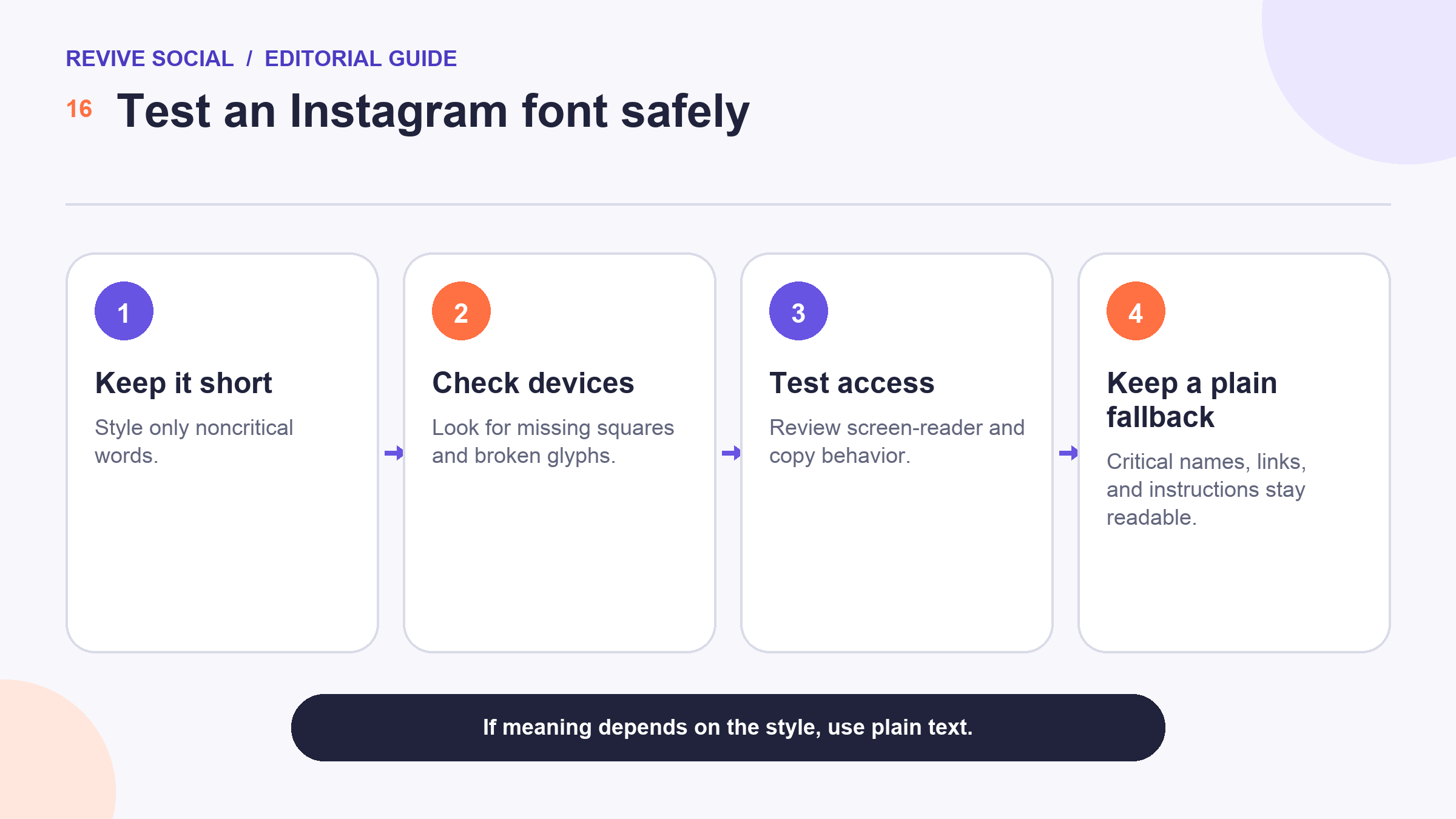
Begin with one short, noncritical phrase. Do not convert the entire bio, a phone number, an email address, a URL, a product name, or instructions that people need to act on.
- Type the phrase in plain text and save that version.
- Generate one decorative version and copy it carefully.
- Paste it into a temporary note before adding it to Instagram.
- View the profile from the devices and browsers your audience actually uses.
- Copy the text back out and confirm that the characters and spacing survive.
- Ask someone using a screen reader to review it when the text is important.
Look for empty squares, question marks, broken accents, reversed order, missing spaces, or characters that are difficult to distinguish. A style that looks fine on one phone may not be acceptable for the whole audience. 🧪
Test the surrounding profile, too. Decorative text can take more visual space and make an already dense bio harder to scan. If you cannot verify a good result, keep the plain version.
| Check | What to look for | Fallback |
|---|---|---|
| Visual | Missing boxes, spacing, accents, line breaks | Use fewer substitutions |
| Reading | Natural screen-reader output | Restore standard characters |
| Copying | Text survives copy and paste | Keep the plain original |
| Meaning | Message works without decoration | Move style into an image |
Record the test result rather than relying on memory. A small content team can keep a list of approved accents, prohibited characters, devices reviewed, and the plain-text replacement. Recheck that list after a major operating-system or app change. ✅
Use Unicode text in a bio, name, or caption
The basic copy-and-paste workflow is simple, even though field labels can change:
- Open a generator and type a short phrase.
- Choose a restrained version that remains recognizable.
- Copy the generated characters.
- Open the relevant Instagram profile or post editor.
- Paste the characters, preview the full field, and save only after checking the result.
- Reopen the saved profile or post from another account to confirm the public rendering.
Use styling as an accent rather than the main information layer. A short label such as a section opener may tolerate more decoration than a business name or booking instruction. For prompts and caption ideas, this guide to Instagram questions is a better place to work on the message itself. 📝
Keep the original plain text in your content notes. That makes it easy to restore the meaning if the styled version breaks after a device, app, or platform update.
Keep accessibility and discoverability intact
Decorative Unicode can create friction for people using screen readers, voice control, translation tools, or older software. Some characters may be announced by their technical names or read one at a time rather than as the word you intended. The safest approach is to keep important meaning in standard characters.
- Keep the account name and business identity readable in plain text.
- Do not style URLs, email addresses, phone numbers, hashtags, legal terms, prices, dates, or safety instructions.
- Use normal capitalization instead of decorative symbols to create emphasis.
- Provide the same essential message in the caption or image alternative text when text also appears in a graphic.
- Do not assume that search or recommendation systems interpret decorative characters like their plain-text equivalents.
Accessibility is not a final checkbox after choosing a style. It is part of deciding whether the style belongs there at all. If a reader must decode the lettering before understanding the message, the decoration is working against the content. ♿
Review current tools without stale counts
Fancy-text tools change, disappear, add advertisements, and vary in how clearly they explain their output. Treat the following as examples to evaluate, not a ranked list or a promise of device compatibility:
- Sprezz has an App Store listing for a keyboard and font utility.[2] Review its current privacy details and permissions before installing it.
- InstaFonts provides a browser-based text generator.[3] Test the output instead of relying on the preview alone.
- LingoJam offers an Instagram-focused generator page.[4] Its labels do not establish platform support.
- CoolSymbol includes a browser fancy-text generator.[5] Avoid copying extra symbols you did not select.
- Meta Tags provides a preview-oriented font generator.[6] A preview is not a substitute for testing in the final field.
Before publication, recheck every destination, app listing, privacy disclosure, and output. Do not choose a tool because it advertises a large number of styles. One readable accent is more useful than a catalog of options your audience cannot interpret. 🔎
Keyboard apps deserve extra scrutiny because a keyboard can process what you type. Read the current store privacy information, review requested permissions, and follow the device vendor’s warnings about broad or full access. Do not type passwords, payment details, private messages, recovery codes, customer data, or confidential work through an unreviewed third-party keyboard. A browser generator used for a noncritical phrase may require less device access, but its privacy policy and data handling still need review.
Close pop-ups carefully and confirm that copied text contains only the phrase you selected. If a site unexpectedly asks for a login, extension, profile, or download, stop and use another method. 🛡️
Fix boxes, missing characters, and copy-and-paste problems
If you see square boxes or replacement symbols, the device or software may not support one or more pasted characters. Restore the saved plain-text version first. Then try a simpler style with fewer substitutions, or style only a short word that is not essential.
When spacing disappears, paste the text into a plain note, remove unusual spaces, and rebuild the phrase with standard spaces. If capitalization, accents, or numbers change, do not correct the visual result by adding more symbols. Switch back to plain characters. 🛠️
A failed save can also indicate that the field rejects a character or that the app changed. Remove the styled text, save the plain version, update the app if appropriate, and test again with a single word. Never give an unknown keyboard broad device access simply to solve a formatting problem.
Know when plain text is the better choice
Use plain text whenever accuracy, accessibility, search, copying, or trust matters more than visual novelty. That includes business names, support details, crisis updates, regulated claims, prices, offer terms, event information, and any instruction a customer must follow.
Visual consistency can come from spacing, concise writing, images, and a recognizable color system instead. If the goal is a coordinated profile, the dedicated guide to Instagram Highlight covers explains a visual layer that does not require changing critical profile text.
You can also create hierarchy with ordinary characters. Put the most important sentence first, use one short line per idea, choose familiar words, and remove filler. In a graphic, select an actual typeface with a clear license, export a readable image, and keep the same information available in the caption or alternative text. These choices provide visual identity without replacing letters in a field people need to search or copy. 🖋️
The best Instagram font is the one your intended audience can read without effort. Style a small accent, test it in context, and keep the plain version ready. ✅
Create a tiny house rule if more than one person edits the account: where decorative text is allowed, which plain-text fields must never change, who checks accessibility, and where the fallback copy is stored. Review the rule whenever the profile design changes. That keeps a one-time experiment from spreading into every caption without evidence that it still works for the audience.
References
- [1] Meta: New ways to create content on Instagram
- [2] Apple App Store: Sprezz
- [3] InstaFonts
- [4] LingoJam Fonts for Instagram
- [5] CoolSymbol fancy text generator
- [6] Meta Tags font generator

